Why did you create this work?
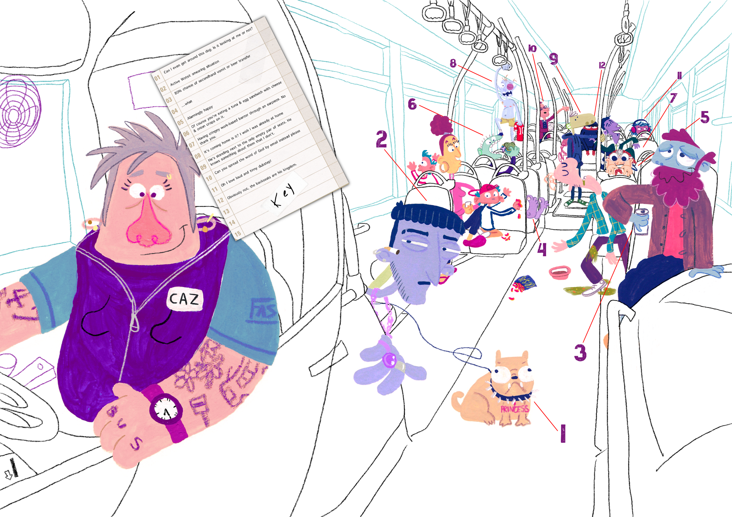
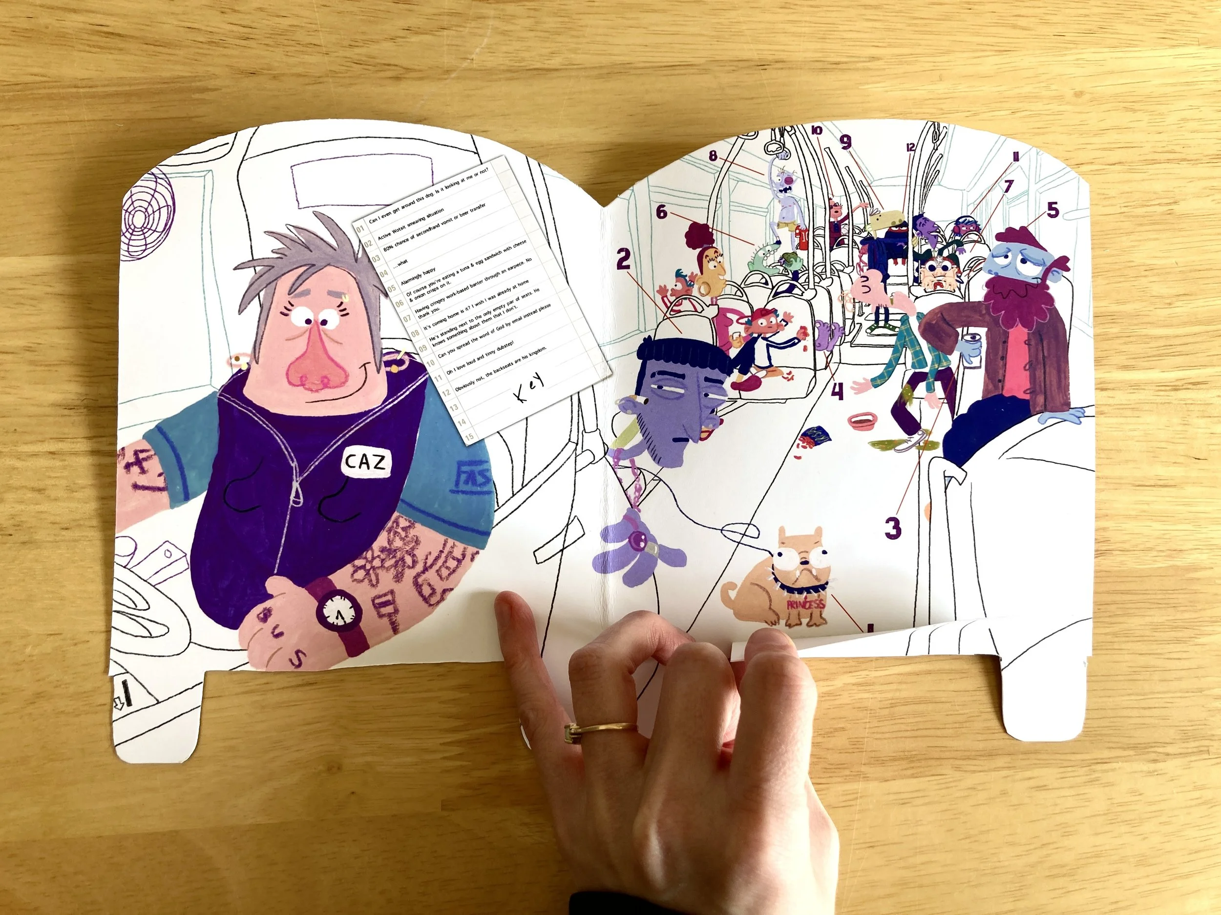
I wanted to create a juxtaposition of sorts, in that the map would mirror the viewer’s experiences and make them feel connected rather than lost. Approaching a busy public bus and wanting to avoid certain passengers is a common theme, and I sought the opportunity to poke fun at the situation many of us have found ourselves in to reduce some anxiety and overwhelm surrounding it.
How were your illustrations used?
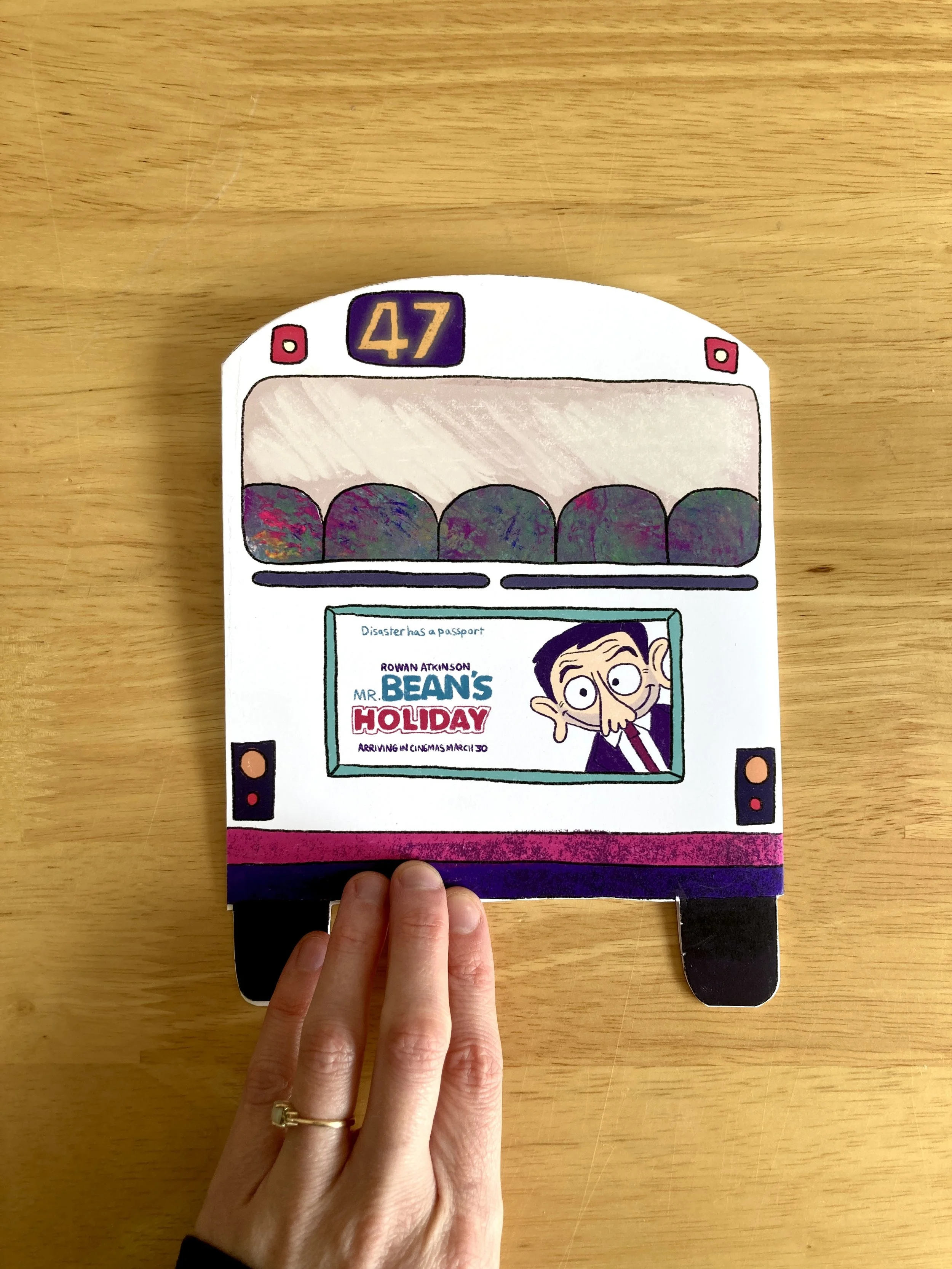
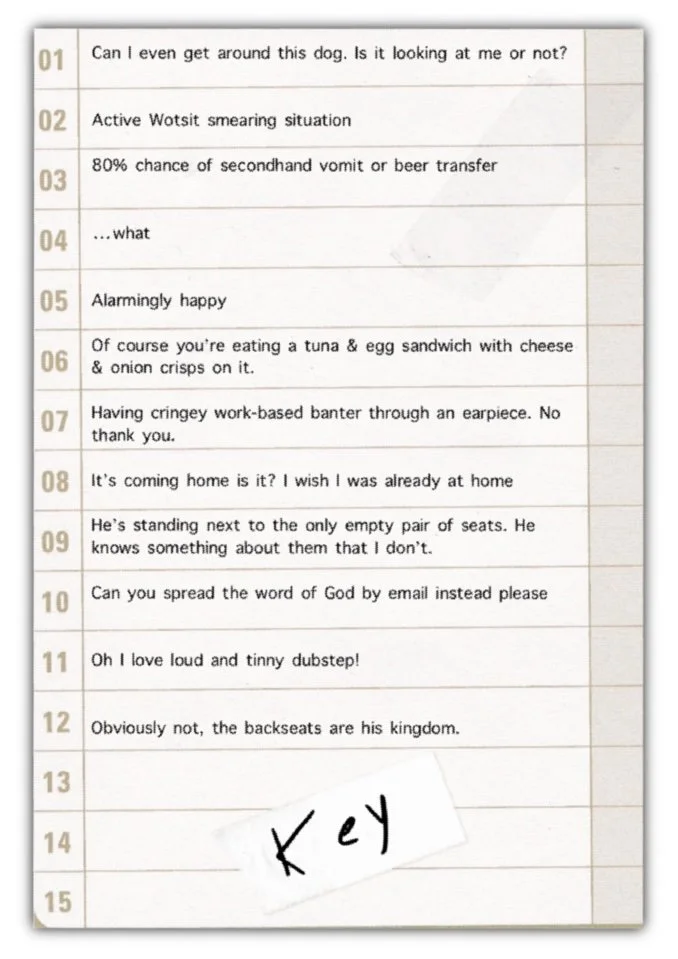
The positioning of the characters was vital as I wanted there to be no clear empty space to sit so that the viewer can connect with the map and try to spot a ‘safe’ seat for themselves, scanning towards to the back of the bus as though they were really a passenger. To further the relationship between the map and the viewer, the map is a physical product with a space to hold their ticket/ID/bus pass etc.
What materials and techniques did you use?
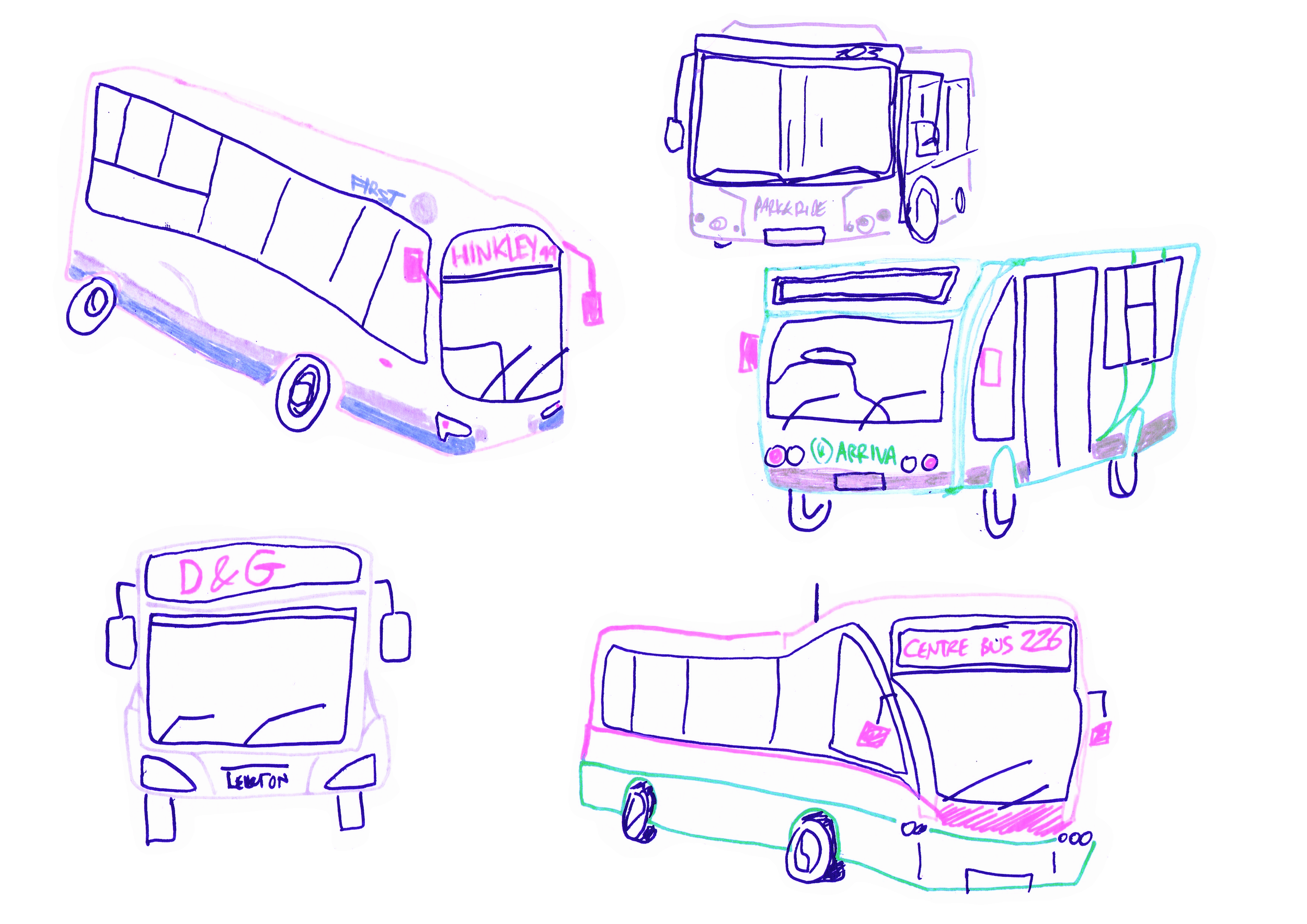
Gouache and colouring pencils are predominantly used, with digital elements added later in Procreate. Nonsensical colours allowed the passengers to contrast from one another effectively; the fun tones giving an interesting juxtaposition against the natures of the characters. I opted to keep the actual bus as simple linework to allow the focus to be primarily on the passengers, which I feel emulates our perception and the discomfort it brings when entering the bus in real life!
Don’t Sit There